![]()
 Photography: Ryoji Kudaka
アジアの優れたパッケージデザインを賞賛するTOPAWARDS ASIAから、
アオバトが手がけたパッケージデザインが月間賞をいただきました。
このアワードがユニークなのは、応募制の賞ではなく消費者目線で集められた商品が審査され賞賛されるということです。
アオバトはデザインアワードには応募しないので、
このような形でデザイン賞を受賞するとは思いもよりませんでしたが、
日々の仕事に対して評価されたことは、とても励みになります。
本当にありがとうございました。

Outstanding in Functionality | FOOD
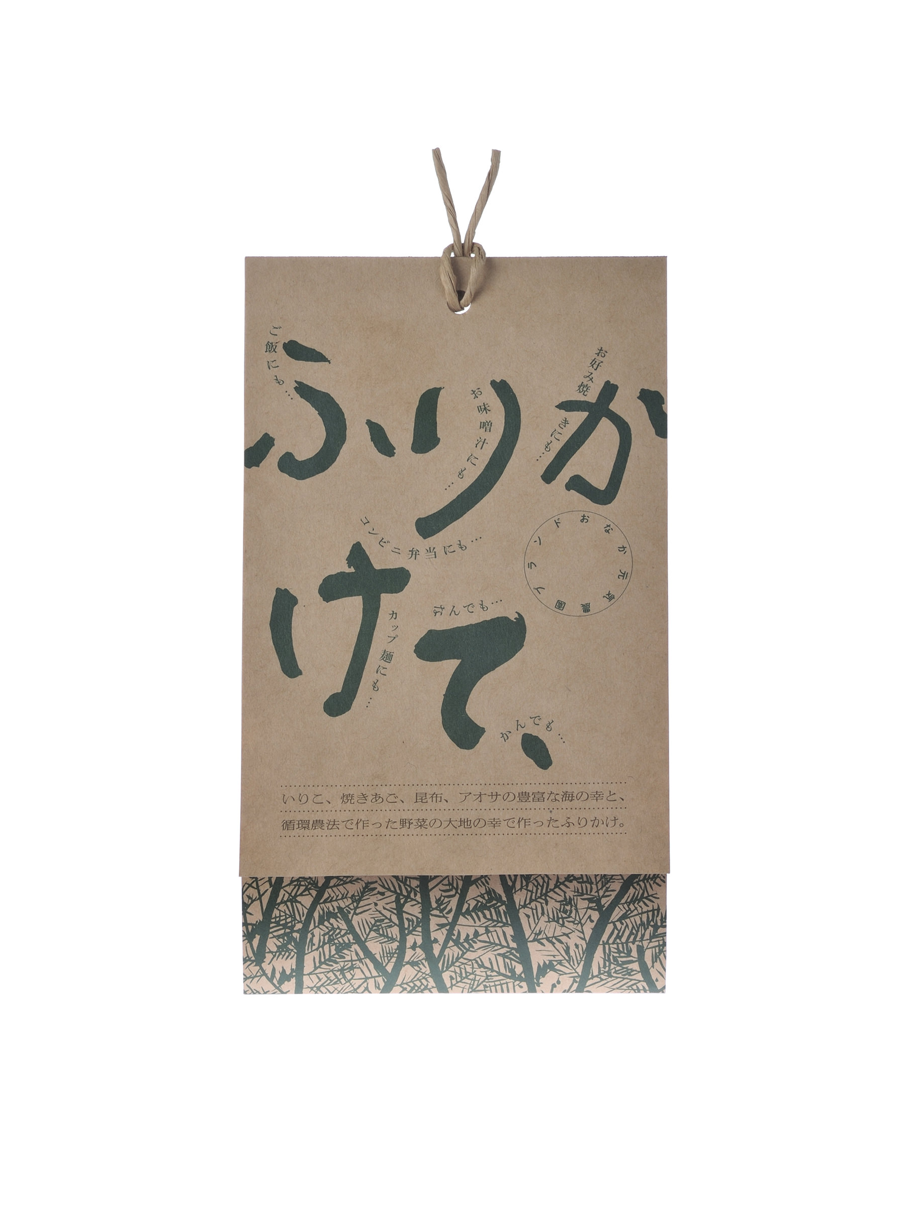
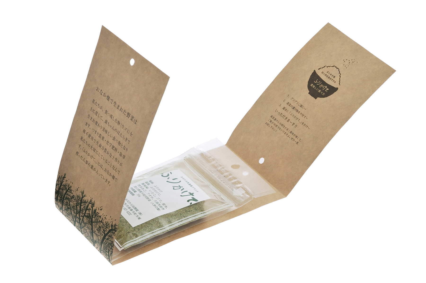
『ふりかけて、』は、生ごみを有効活用した循環型オーガニック調味料です。
それは、人々にあまり知られていないチャレンジングでニッチな商品。
大切にしたことは、この商品が何者であるか一目でわかること。そしてクライアントとの共同作業。
『ふりかけて、』とは、その名の通りふりかける。
いろんな料理にふりかけて食べて欲しいので、一目でわかるそのままの名前を提案しました。
ロゴタイプは、ディレクターが書き方をガイドし、クライアント自身が書いた文字を採用。
なぜなら、作り手本人だから。
パッケージは、オーガニックな雰囲気を出すことと、コスト削減を重視しました。
厚手のクラフト紙にオフセット印刷した状態で納品するだけ。
折りとトムソン作業はクライアント自身に任せる、至極アナログな方法です。
この1枚に、商品説明から注文方法まで情報を詰め込み、次の購買に誘導するようにしています。
“Furikakete is recycled organic seasoning made from recycling raw materials (what we consider garbage). It is a challenging and niche product as the concept is not widely known or popular yet. It is important to create a design so the product can be recognised at first glance, and of course to collaborate with the client.
“Furikake” means “sprinkle” and “furikakete” means “just sprinkle it” in Japanese. Because we wanted consumers to sprinkle the seasoning on various cuisines, I proposed the name as it can be understood at first glance. For the logo, I adopted and used the maker’s hand writing to put emphasis on the creator behind the product.
The package design aims to give an organic feel and focuses on cost reduction. The design is printed on thick craft paper using offset printing. The product description and ordering methods are also printed on the packaging. It can easily be put together by the maker.”